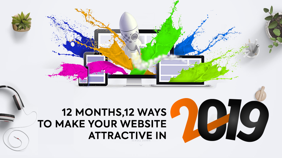
Another year! More hustle! More trends! More ideas! And the ultimate battle to stand out!
Your website reflects a lot about your brand. Thus, having an attractive website is pivotal. However, with an array of trends getting introduced every year, it becomes difficult to keep track of what stays and what goes.
But something remains- the zeal to make your website stand out in a crowded landscape. To get noticed because that is the beginning of everything.
You get noticed, potential clients come to your website, subscribe for your product/services, increase your sales, improve your business prospects and ultimately enhance your business.
Therefore, your website should be stellar.
Before you go spiral down the slippery slope of anxiety and stress, we have something for you that might make you happy this New Year!
Tips to make your website attractive.
Now rather than going all at once, we have covered one tip for every month. So, every month, you work on one aspect of making the website remarkable. By the end of the year, you will reach your destination.
Keep reading to find out more.
January: Pay Attention to the Fonts
You are not required to be a master designer to realize that certain fonts don’t work with certain backgrounds. Yes, you do not need designer level expertise to comprehend this essential but straightforward rule.
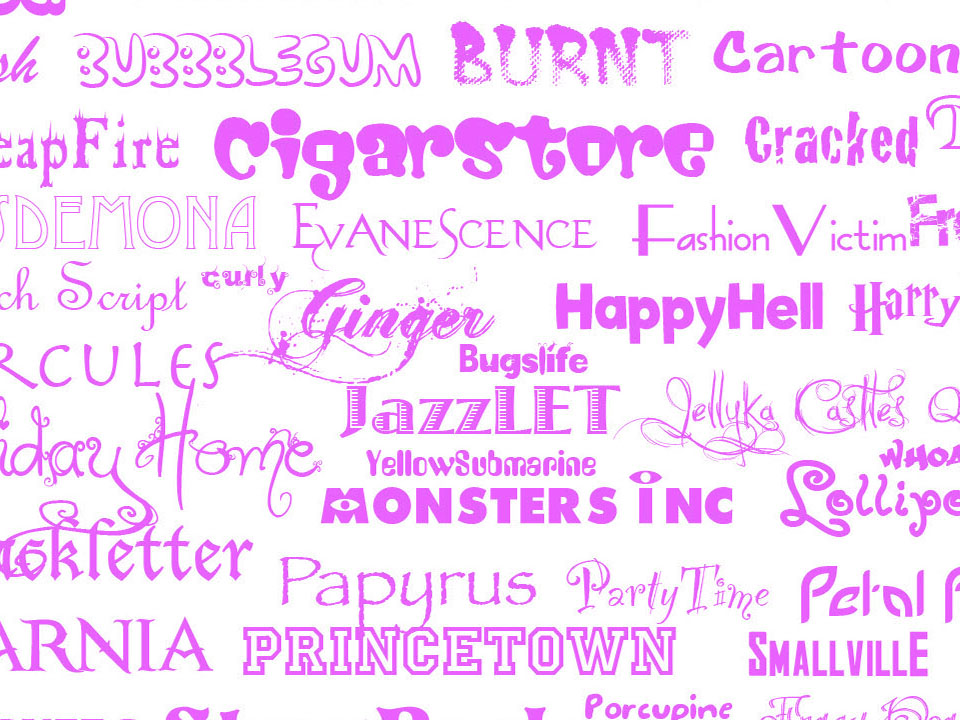
There are a few fonts which are not meant for particular backdrops and look better when incorporated with different designs. But should you stick to the old boring fonts? Absolutely not!
The fear of getting the font wrong is so inherent that people (including designers) forget to experiment. Fonts play an essential role in the appeal factor of your website. Not only do they make the entire thing look better, but a certain level of readability also depends on the same. It is also responsible for reflecting the mood of the website.
For instance, a website that predominantly targets the youth needs to have a font that complements the nature and feel of it.
Switching the website font can add drama to the web pages. It can drastically change the outcome, making it appear attractive.
Takeaway– So, experiment with different fonts before finalizing one. And don’t stick to the mundane versions if you want your website to stand out this New Year!
February: Make Your ‘Landing’ Page Likeable
“Landing pages have 70-90% bounce rates.”
Alarming but true! Not a lot of websites pay attention to the landing pages, yet, it is one of the most visited (and pivotal) pages on the site. This is the reason why landing pages on an average have the highest bounce rates.
Most websites have a very plain and simple landing page, often ignoring its potential. But the fact is that by making the landing page a little exciting (even personalized), you can retain the interest of the readers/visitors. A little quirk can never hurt.
Try to make it likable for the people visiting your site. Analyze the bounce rate. Experiment!
If you want an outstanding Website, think outside the box to make your landing page amazing in its appearance.
Takeaway– So, put in a little more thought to your landing page and witness magic happen!
March: Use Sliders
The use of sliders has become widespread on most websites. And sometimes these are even overused! But does that mean you should not include it on your site?
Well, the answer is NO!
You should include the sliders but…make sure that these are attractive. Experimentation is the word of choice here. Most modern website design in 2019 has to include sliders but with a twist.
Sliders are significant for a site because it adds credibility to the same. They give the readers/visitors an idea about what information they will get from the content available. But since these have become commonplace, you need to make sure that the versions added to your site should narrate a different story.
Use visual effects or write inspiring messages on the slider. Incorporate various types of visual techniques to make it appear interesting. Your aim should be to grab attention with the slider, and you better invest in it.
Takeaway– So, make the slider exciting and allow your website to become something different; something exhilarating.
April: Work on the Quality of Image
Images play an essential role in optimizing your website’s design. Even by merely adding an image to the backdrop, you increase the engagement rate of your readers/visitors.

Pictures narrate a story of their own, which adds credibility to the content as well. However, the idea here is to not stack them just for the sake of it because everyone does it. You should opt for relevant images that add value to the overall appeal of your site.
And while still at the mentioned topic, you should keep in mind that using quality images is a must! High-quality static visual material adds value to your site, making it look more exquisite.
However, don’t over-edit them either. Try to make these look real and natural. If possible, seek expert advice and leverage the pictures and their quality.
Takeaway– So, add good quality images to your website to make it more appealing.
May: Apply the Parallax Effect
Parallax effect or more commonly known as parallax scrolling is one of the most common website design trends that never seem to grow old. And there is a justified reason for it too.
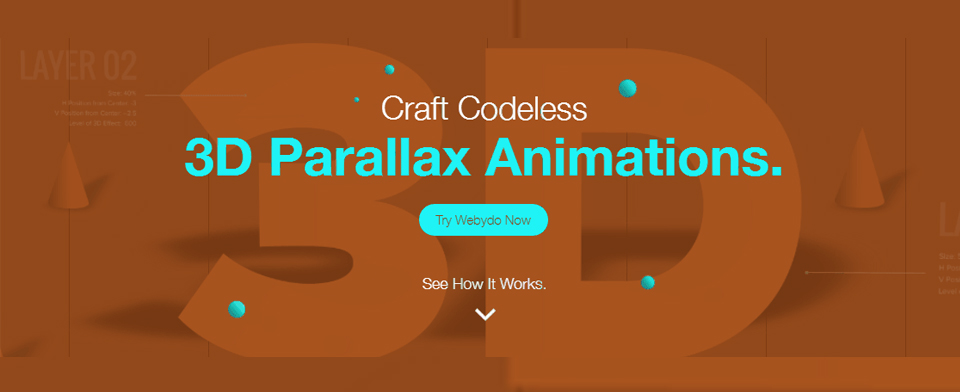
Wait, what is parallax effect?
It is a website effect where the background of the page moves slower than the foreground when scrolling, creating a 3D effect. It is a subtle element that when used appropriately forms the most mesmerizing feature.
Yes, many agree that the parallax effect can be overwhelming at times. But the truth is that when this effect is used correctly, it creates a distinct appeal that allows the website to stand out.
The parallax effect is still quite prominent in the landscape of website design. And using it on your website can give it the right touch of innovation. Make sure that it creates a narrative and adds to the overall appeal of the site.
Using the parallax effect has its appeal. Use it definitely but sparingly.
Takeaway– So, use the parallax effect to ensure that the website gets a unique feel and the right pop.
June: Adjust the Navigation Bar
The navigation bar plays a significant role in the aesthetics of your website. Many a time, the navigation bar is not visible, which reduces the chances of visitors to navigate the site. One of the latest website design inspiration is to make navigation easier.
Making the navigation bar visible and easy to manage is one of the first changes that all websites should incorporate in 2019.

Not only visible, but the navigation bar should be unique as well. Using innovative titles evokes curiosity in the visitors, influencing them to navigate the site further. Breaking the old stereotype of using the same old title tags for the various pages, it is time to make the navigation bar a little quirky.
Takeaway– So, make the navigation bar innovative to add subtle elegance and fun to your website.
July: Make the Text Readable
Your website looks amazing! It is colorful, it is attractive, and is impressive. But nothing is readable!
Do you think that your site will score well with the readers/visitors if the text on it is not readable?
Well, you know the answer to that! No matter how unique and innovative the design of your site is, if it is not legible, the whole point kind of gets lost.
The font size matters. They should not be too tiny or too large. Try out different sizes before finalizing one. This is one of the most ignored aspects of a website. Nonetheless, this year is the time to integrate the differences.
Takeaway– So, make your text legible by adjusting its size. This makes your website reliable.
August: Work on the Content
It doesn’t matter what your website focuses on, as long as it communicates with the readers/visitors. Content is the best way to engage with your clients.
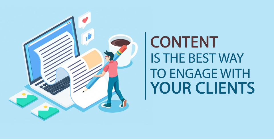
Whether solving their problems or informing them about something important, with the right (form of) content, communicating with your audience becomes easier.
It is also simpler to showcase your skills with content. Be it your creativity or your problem-solving abilities; you can reflect your skills effortlessly.
Now, content can be in different forms. Blogs, articles, videos, infographics, eBooks and white papers are some of the most common types of content available. You can start writing any one of the contents of your choice (also something that is relevant) and give your readers/visitors much to be interested in. You should also repurpose the old content to make them fresh in a more effective way.
Various studies have proven the fact that publishing content frequently (including repurposed old blogs) increases customer engagement and boosts the conversion rate. The website also looks more reliable with content published on it.
Takeaway– So, work on creating content and increase customer engagement. It also helps your website to look more consistent.
September: Make the Social Media Share Tabs Visible
The world revolves around social media. And the fact cannot be undermined that adding social media share buttons on websites is indispensable. It doesn’t matter whether you share content or product or service; you need to be visible on social media.

However, when it comes to websites, and most of them to highlight here, pay little to no attention in making their social media share buttons visible. Most of the time, the buttons are necessary and not evident. Even if these are added, they lack the creativity to influence the readers/visitors to take the initiative.
As one of the leading new website design trends, you should pay attention to making the buttons noticeable. You can further customize the buttons and add descriptions about the sharing requirement. By automating the buttons, you make it easier for the readers/visitors to share the pages (without making the extra effort).
Takeaway– So, make your social share plugins visible, personalized and automated to ensure that you get the right social media presence for the brand.
October: Incorporate a Video (or Two) on the Landing Page
While we did discuss the possibility of making a website stand out using a customized landing page, there is one more aspect that can make your site fantastic. What is it you ask? Well, incorporate a video.
A quick introduction to your website using a video is just smart. Explaining a product/service using a video is nifty. Reaching out to potential clients using a video is easy. Forging connection with your customers become fruitful when using a video.
Video content is engaging for it can express a lot even in the most limited time. Visuals are known to capture the attention, boosting a person’s attention span. More than 71% of executives have agreed to watch product/service videos before making a purchase.
A video adds credibility to your website and the content. Just make it likable and relatable to ensure that you get actual conversions.
Takeaway– So, invest in good video, and you can quickly boost the appeal of your website.
November: Add Call-to-action
There are many rumors surrounding the use of call-to-action. The first question is- what exactly is CTA?
It is a marketing term that is used to get a prompt response from the user. A widely used word, CTAs are more critical than you can guess.
As highlighted, CTAs influence immediate response. This means that with the right CTAs, conversions become more natural and faster. However, adding the right CTA is essential. For instance, the two phrases: (1) Are you ready to subscribe to our blog? or (2) Subscribe Now! – Give the same message; however, if a choice is to be made, which one would you opt for? Which one caught your attention? The second one, right? That is because it is more authoritative and provides a more definitive solution. The readers/visitors know what they are supposed to do.
Consumers expect CTAs on blogs. Even before digital marketing existed, they expected it. From billboards to TV commercials, everything included a CTA. With the internet, the opportunity to become more vibrant is viable.
You can psychologically trick your consumers to click on the CTA button. By making the font and color impressive, and by using visual elements, the CTA can be made visible to the consumers.
Experiment with different types of CTA phrases to see which one works better for your brand. Apply the A/B testing to find out the final CTA you will put on the site. But ensure that there is a CTA on your website.
Takeaway– So, include Call-to-action buttons. Make these attractive and visible, compelling and persuasive, to ensure that you can end up with enough conversions.
December: Make it for them
Yes, the website should talk about your brand and give a clear insight into your product/service, but in the end, it should be all aimed towards your customers and clients. It is them who should ultimately benefit from this.
The value of your product/service should be communicated clearly to the readers/visitors. It should resonate with them and fundamentally solve their problems. It should provide them with some value. Your end-goal should be to make them feel great after visiting your website.
There are numerous examples where the website in spite of having the features for the best of intentions became ultimately about the brand. Don’t fall into the trap.
From the design to content, everything should be customer-centric. So, make sure that you incorporate little things that make your site usable and likable for the customers. This is what will make it stand out.
Takeaway- So, ensure that you design every aspect of your website for your customers/clients. It should be about them.
Conclusion
A website is a gateway to understand your brand, to familiarize with your product/service, to give what people are looking for. In a world that is marked by fierce competition, it is not easy to stand out in the crowd. But with the right tips, the journey becomes more comfortable.
Keep the tips as mentioned above for web design for 2019 in mind and make sure you keep applying them throughout the year till your website indeed becomes the beacon of success.
Be the future of Digital Marketing with us.
#JoinUsForMore


